
How our colours are used
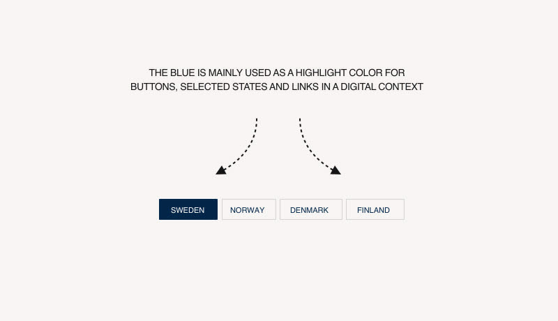
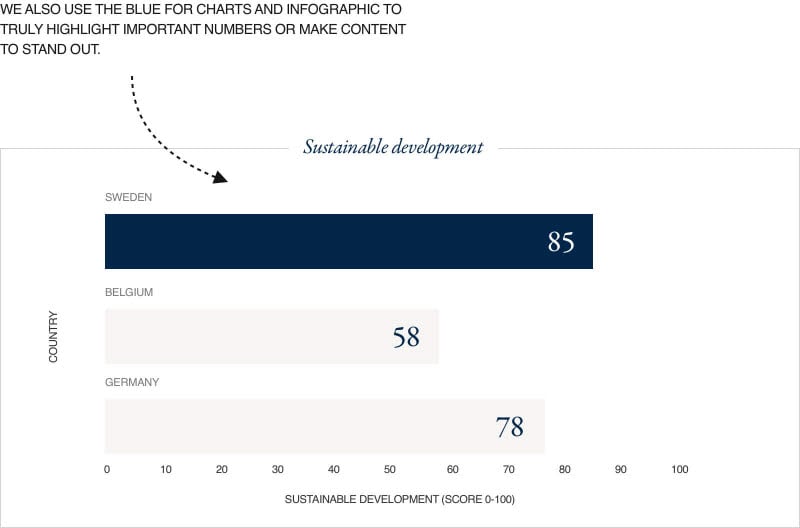
Dark tones reinforce the perception that Business Sweden is a premium brand. The two most important colours in our pallette are black and blue, with blue used as a highlighting colour for specific elements (including buttons, charts or graphics). The contrasting sand colour is used in backgrounds to add warmer tones to the overall look and feel. Yellow and other secondary colours are used to highlight details in graphs and illustrations.
secondary coloUrs
Secondary colours in the palette are to be used in specific formats and tools, for example in PowerPoint and Word. If you have any questions about using the colour pallette, reach out to us below.