General requirements
The Gotham font is used primarily used for all headings, subtitles, name plates, etc. Garamond can be used to highlight certain content, for example, quotes. Always use the correct HEX-codes and stick to our primary colours.
Video Selections
We are often dependent on stock videos, and while free stock is often good, higher quality is better. View our image guidelines and try to match the look and feel.
The recommended stock service is artgrid.io. If it is unavaoidable and you have to use low quality stock, please take the time do adjust colours to match our image guidelines.
Subtitles
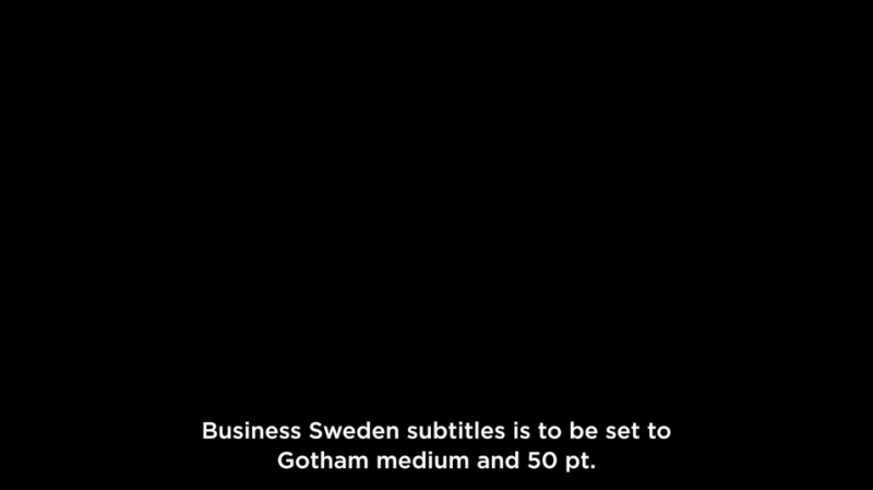
Use Gotham bold 50 pt. For exact settings, click here to see screen grad example.

Headlines
Headings should always bin Gotham Bold full caps.
It is possible to add lines to make a heading pop.

Numbers
A quick animation can go a long way. Here’s an easy animation that can help to catch the eye of the viewer.
Lower thirds
We’ve created both a blue and a white version. To be used with or without the box - depending on your video's environment. To see an example of how it is placed and applied, click here.


Explainer videos
Our most frequently used video format is a image/video slider with animated text. The ideal time frame to explain a complex topic is just under a minute or so. Please see below examples for inspiration on how to make it come alive.
Be playful!
Even though we have pretty strict guidelines - it doesn't have to be dull. Especially for social media we need to be bold and catch the attention of our audience quickly.
Visit Business Sweden on YouTube for more inspiration on how our brand can come to life with the help of motion design.