PHOTOGRAPHIC IMAGES ARE SORTED IN TO THREE DIFFERENT CATEGORIES
There are three distinct image type categories used in the Business Sweden brand. When used consistently, these strengthen the image of Business Sweden by creating a unity brand and driving recognition.
Business Sweden employees can access images and videos in ImageVault.
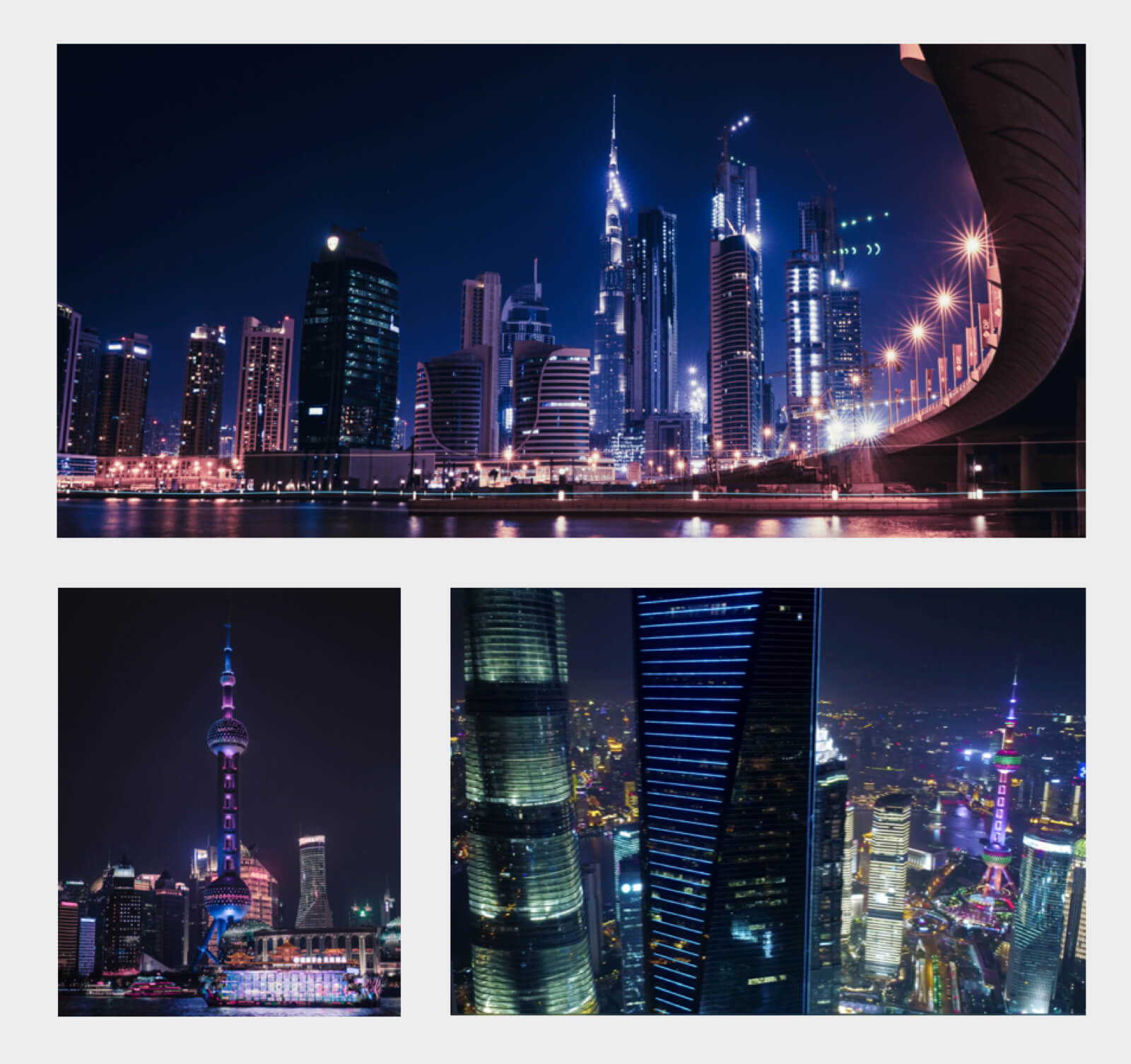
Category 1: global
The primary image category is global, which uses brand-driven images based on international urban environments. These images always have black and blue tones.
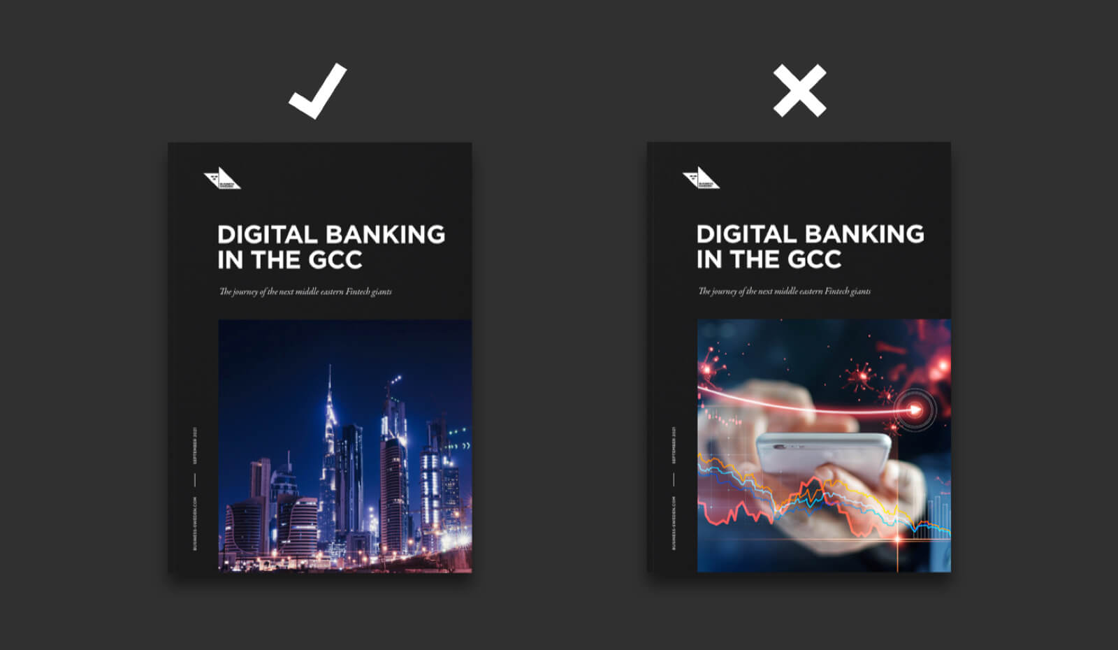
We use this category for campaign images, header images in digital campaigns, report covers, and image material for social media posts, and other content marketing.
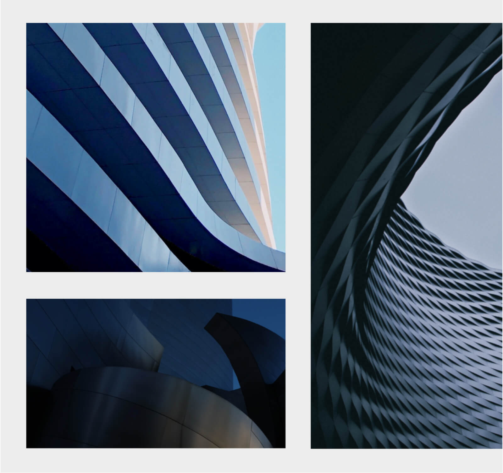
Category 2: abstract
The secondary category is abstract, based on progressive forms with an architectural base point. These images are used when urban environments do not fit well with the content, we then let the shapes combine and lift the associated text.
Abstract images are used as campaign covers and for purely decorative purposes such as wallpapers on our website. Although more liberal in colour, we prefer abstracts to have a blue and black tone.
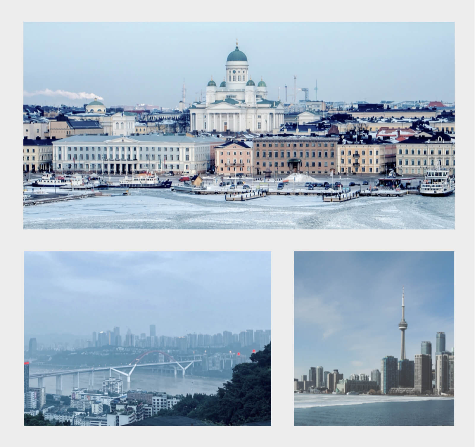
Category 3: complementARY
The third category is complementary, used to add a dynamic shift, these images are much lighter in tone.
Images from this category should only be used as complementary images in articles. Never as promotional images or covers.
Our people
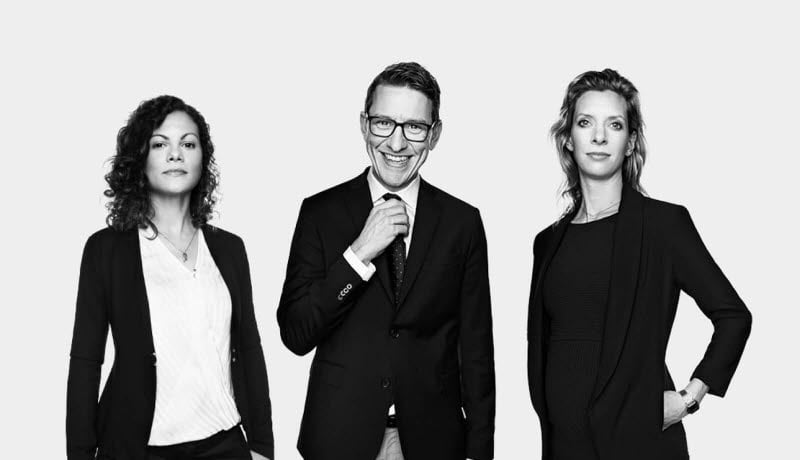
Our people are the real brand ambassadors for Business Sweden and we aim to highlight them in all of our applications.
We mainly use striking black and white photography and images with two or three people are preferred, except in individual contact forms.

Positioning
Our goal is to inspire global growth by promoting international opportunities and development. This position of global inspiration is the starting point for our image choices.
Instead of specific and narrow subject-focused images, we instead zoom out to give the international perspective.
When we choose the cover image for a report on potential in the financial industry in the Middle East, we use an inspiring urban environment image that signals international opportunities, not a picture of a bank, financial instrument, or money.
When global urban environments aren't the right fit, we use lighter abstract environmental images with architecture as a starting point that lift and capture the feeling of the subject.
UsE and image hierarchy
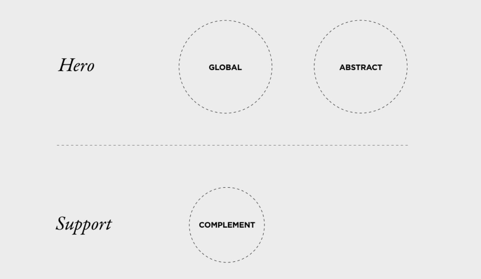
To preserve the value of images, we have a simple hierarchy system.
Headers on our site are always assigned images from the global and abstract categories.
Images from the complement category are only used to support articles, never as hero or cover images.
Examples
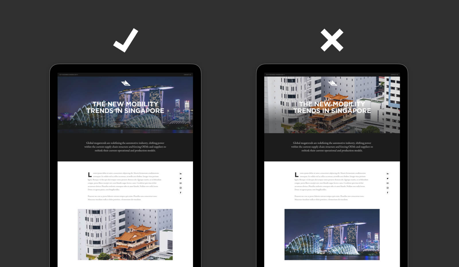 Always use the “global” or “abstract” image categories for headers. Never the lighter “complementary” images.
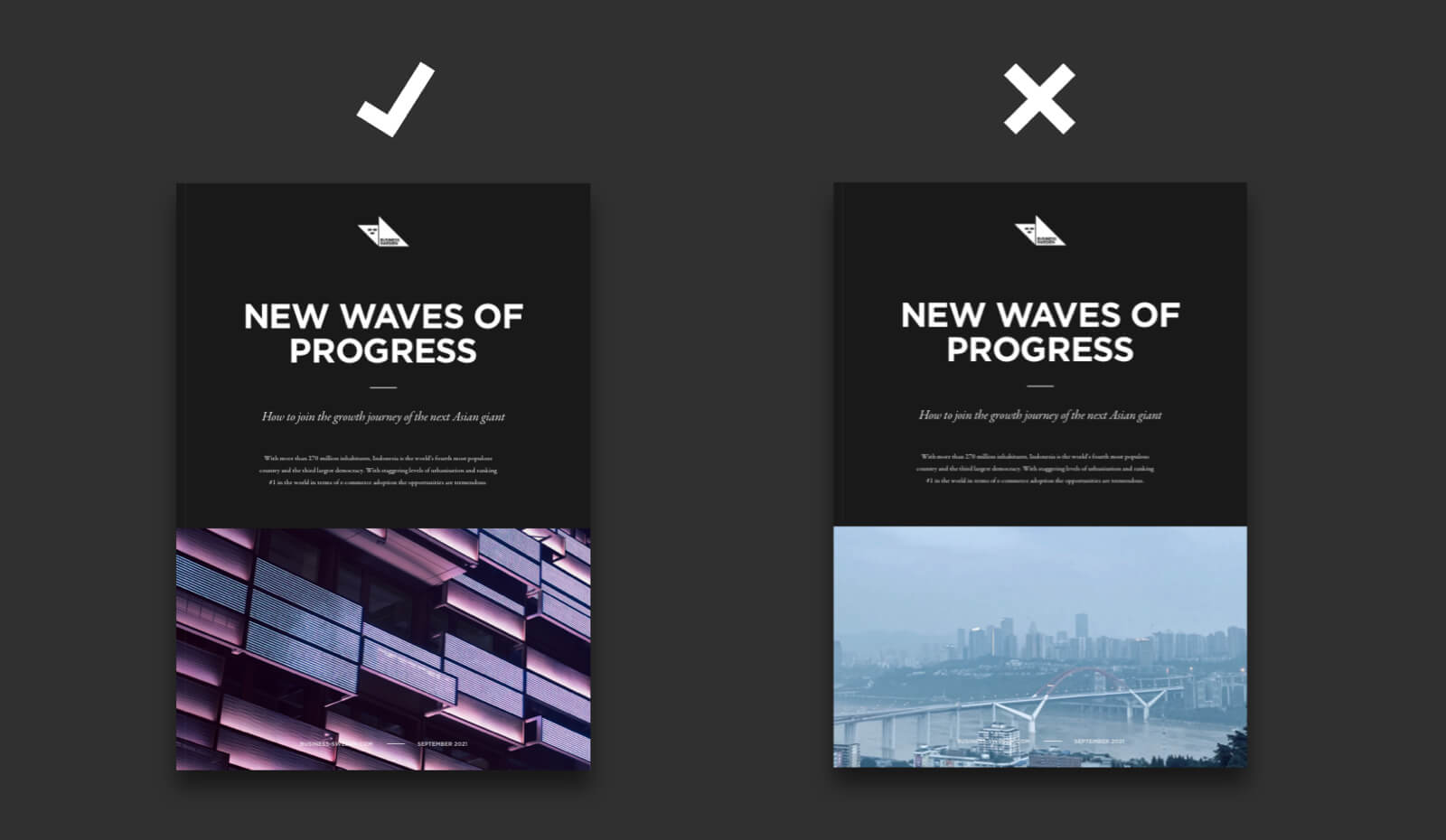 Correct use of “abstract” as a cover image to the left. Incorrect use of a “complementary” image on the cover to the right.
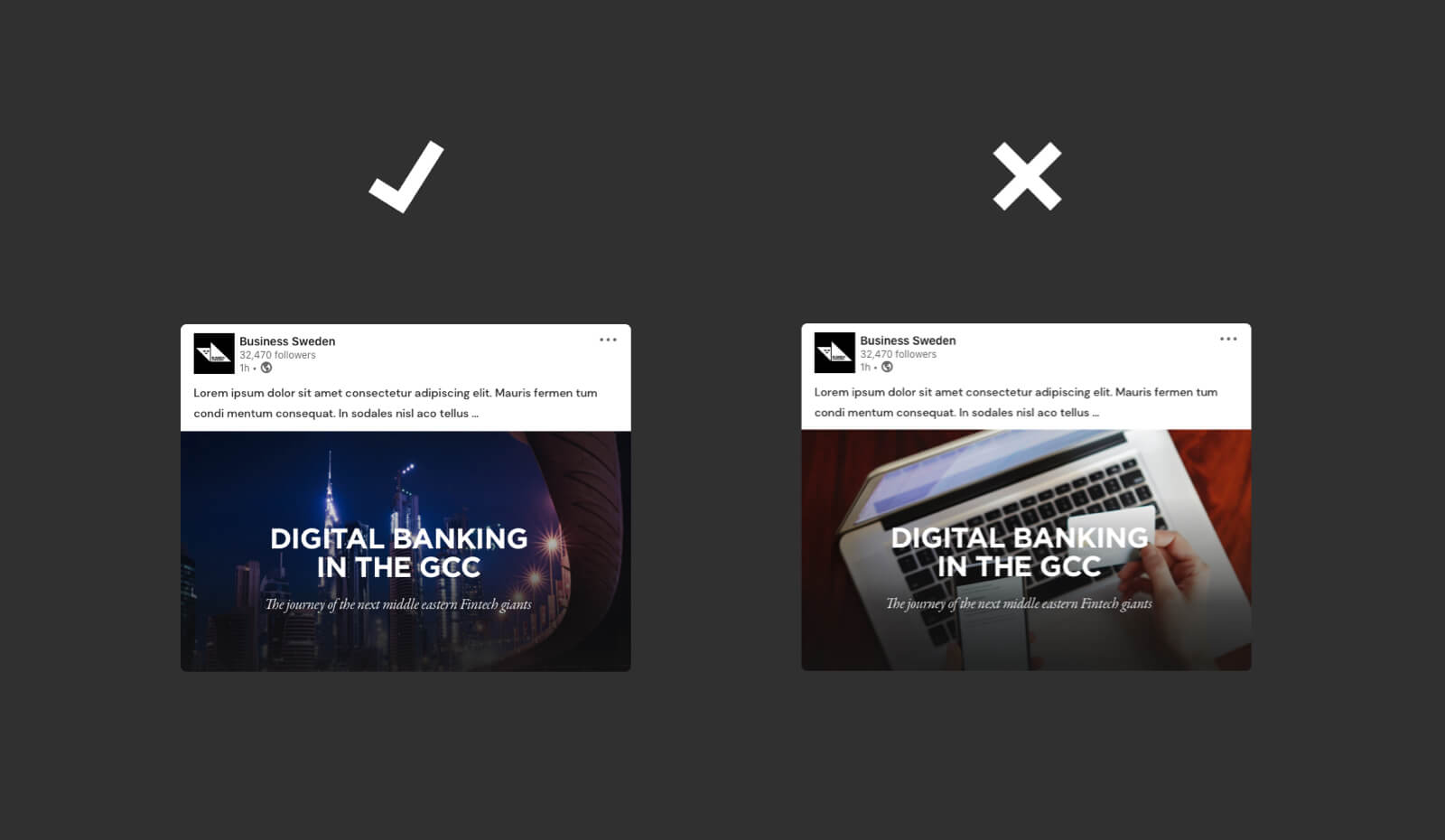 Correct use of “global” as a social media post image to the left.
